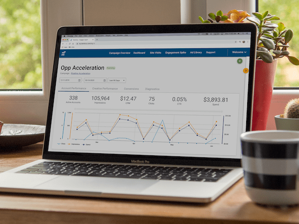
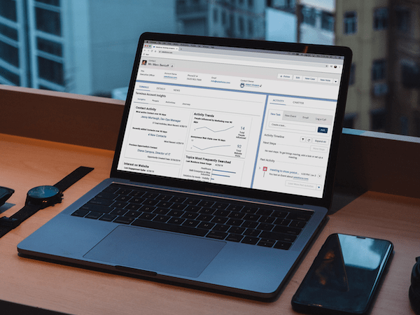
As the first design hire, established Sonar's design system and redesigned core navigation and IA (Information Architecture) to create a more cohesive, scalable, and intuitive user experience, directly addressing user pain points and engineering inefficiencies.
Company: Sonar (B2B SaaS, Salesforce Admin Management)
Year: 2021
Role: First Design Hire (Led UX Strategy, Research, IA/Navigation Design, Design System Implementation)
Duration: ~3 months
The Challenge
Joining as the first designer after Series A funding, I inherited an application built by multiple agencies with an inconsistent UI and siloed features that lacked a cohesive, end-to-end experience. I conducted churn interviews and reviewed NPS scores which highlighted clunky navigation as a major user pain point. Engineers faced mounting tech debt due to duplicate components and ambiguous color and typography styles.
The Solution: Unified Navigation & New Design System
To address these foundational issues, I implemented a two-pronged approach:
1. Unified Navigation: Developed a new navigation model inspired by multi-pane tree structures such as the MacOS Finder window. This allowed users to click metadata within any feature and open related details in adjacent "cards," drastically reducing context switching that previously required multiple browser tabs.
2. Design System Implementation: Championed adopting the Ant Design system (an open-source React library) and worked closely with engineering in dedicated sprints to systematically replace custom styles with Sass variables and consolidate duplicative components, tackling UI inconsistency and tech debt head-on.
Key Decisions & Rationale
- Navigation Model - Balancing User Needs & Tech: Customer journey research revealed users frequently needed to view connected metadata side-by-side. The tree/multi-pane structure directly addressed this without requiring multiple tabs — initial customer research indicated it was a natural and intuitive metaphor. Crucially, its non-circular nature also limited technical complexity, gaining immediate engineering buy-in after successful user validation of prototypes.
- Design System - Leveraging Existing & Focused Effort: Choosing Ant Design quickly provided a robust component base within a startup context. Pairing directly with one engineer for focused sprints allowed us to systematically pay down tech debt and establish consistency efficiently without derailing feature velocity.
Outcomes
Improved Feature Discovery & Usage: The new navigation led to a 23% increase in feature usage in the subsequent quarter.
Reduced Search Reliance: Users embraced the contextual navigation, resulting in a 67% decrease in new searches via the search box.
Increased Engineering Velocity: Streamlined components and styles contributed to a 17% increase in front-end engineering output (150 to 175 story points/quarter).
Enhanced Consistency & Scalability: Established a unified visual language and component library, reducing UI bugs and creating a solid foundation for future development.
Reflection
Streamlining navigation and unifying the design system made Sonar feel instantly more intuitive. Users moved through workflows with fewer clicks, and engineering sped up development cycles thanks to reusable components. Partnering closely with engineers proved invaluable — small, focused sprints tackled inconsistencies without disrupting feature work. As Sonar evolves, maintaining and expanding the design system will be crucial to sustaining engineering efficiency and ensuring a consistent user experience.
"Its ease of use is through the roof, and it's very snappy."
Keon Farahdel at Ware2Go


